You know that moment when you click a link on your phone and the website loads all tiny and squished? You have to zoom in, then scroll sideways, then zoom out again just to find what you’re looking for. Frustrating, right? You’re not alone. In today’s hyper connected world, a website that isn’t perfectly tailored to the device you’re using is not just inconvenient; it can actively hurt your business.
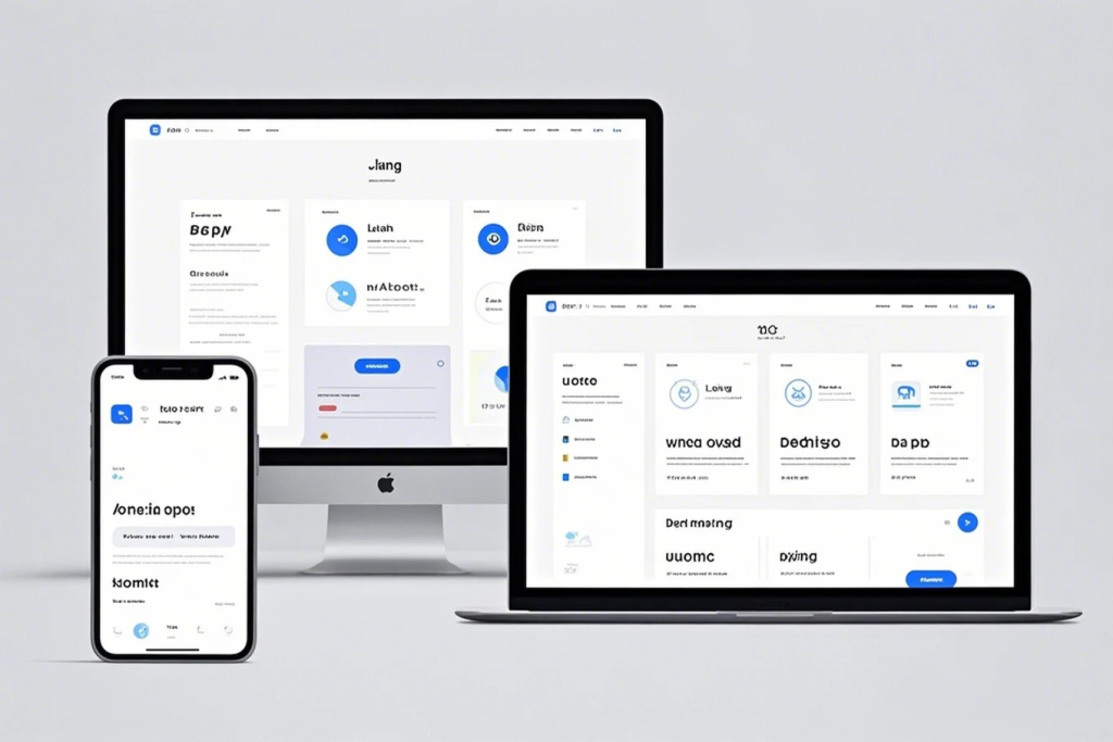
For years, having a mobile friendly website was considered a smart move. Now, in 2024, responsive design, where your website adapts seamlessly to any screen size, from desktop to tablet to smartphone, isn’t just recommended; it’s absolutely essential. Let’s dive into why mobile optimization is no longer optional and how it directly impacts both your user experience and your standing with search engines.
Why Most Websites Still Get Mobile Wrong (and Why It Costs Them)
You’ve probably seen them, websites that look great on a computer but become a usability nightmare on a phone. Maybe the text is too small, the buttons are too close together, or the navigation is impossible to use with a thumb. This “one size fits all” approach to web design simply doesn’t cut it anymore.
Think about your own Browse habits. When you’re on the go, waiting in line, or relaxing on the couch, you’re likely using your smartphone to access the internet. Your potential customers are doing the exact same thing. If they land on a website that’s difficult to use on their mobile device, what do you think they’ll do? They’ll probably hit the back button and head to a competitor whose site is mobile friendly.
This isn’t just anecdotal. Consider these facts:
- Mobile Traffic Dominates: Globally, mobile devices (excluding tablets) generated 58.99% of website traffic in the first quarter of 2023. This trend has been consistently upward for years, and there’s no sign of it slowing down. (Source: Statista) You should be thinking about this from the perspective of a business owner in Quezon City; a significant portion of your local customers are likely accessing the internet primarily through their phones.
- Poor Mobile Experience Leads to Abandonment: Studies show that a significant percentage of mobile users will abandon a website if it’s not mobile friendly. According to a Google study, 53% of users will leave a mobile site if it takes longer than three seconds to load. (Source: Think with Google) You need to emphasize that a clunky mobile experience directly translates to lost opportunities and revenue.
The Dual Impact: User Experience and SEO
The lack of responsive design has a significant negative impact on two crucial areas: user experience (UX) and Search Engine Optimization (SEO). Let’s break down why both matter:
User Experience (UX): Keeping Your Visitors Happy
Imagine you’re a potential customer in Metro Manila searching for a local service on your phone. You find a business website, but it’s a jumbled mess on your screen. You can’t easily find their contact number or browse their services. How likely are you to stick around and try to navigate the chaos? Probably not very.
Responsive design directly enhances user experience by:
- Providing Easy Navigation: Menus and links adapt to smaller screens, making it simple for users to find what they need. Think about designing for thumbs, that’s how most people interact with their phones.
- Ensuring Readable Content: Text flows naturally on different screen sizes, eliminating the need for constant zooming and panning. You want your message to be clear and accessible, not a strain to read.
- Optimizing Images and Media: Images and videos resize appropriately, preventing slow loading times and ensuring they fit within the viewport. No one wants to wait forever for a blurry image to load on their phone.
- Creating a Consistent Brand Experience: A responsive design ensures that your website looks and feels consistent across all devices, strengthening your brand identity. You want your brand to feel professional and trustworthy, no matter how someone finds you.
A positive user experience leads to longer session durations, lower bounce rates (the percentage of visitors who leave your site after viewing only one page), and increased conversion rates (whether that’s making a purchase, filling out a form, or contacting you). Happy users are more likely to become loyal customers and recommend your business to others.
Search Engine Optimization (SEO): Appeasing the Algorithm
Think about how people in Quezon City find local businesses online; they use search engines like Google. And Google cares deeply about providing its users with the best possible experience. That’s why mobile friendliness is a significant ranking factor in Google’s search algorithms.
Here’s how responsive design impacts your SEO:
- Mobile First Indexing: Google primarily uses the mobile version of your website for indexing and ranking. If your mobile site is lacking content or functionality compared to your desktop site, your search rankings will likely suffer. You need to ensure Google sees your best side, your mobile side.
- Improved Mobile Ranking: Websites that are responsive and provide a good mobile user experience are rewarded with higher rankings in mobile search results. If you want to be found by local customers searching on their phones, a mobile friendly site is non negotiable.
- Lower Bounce Rates and Higher Engagement: As mentioned earlier, a poor mobile experience leads to high bounce rates and low engagement. These are negative signals to Google, indicating that your website isn’t providing a good experience for users, which can negatively impact your rankings.
- Avoidance of Duplicate Content Issues: Having a separate mobile site (e.g., m.yourdomain.com) can sometimes lead to duplicate content issues, which can confuse search engines. Responsive design, with a single URL and dynamic content adaptation, avoids this problem.
In 2015, Google officially announced that mobile friendliness would be a ranking factor. Since then, the emphasis on mobile has only grown stronger with the introduction of mobile first indexing. If you want your small business in the Philippines to be visible in online searches, you simply cannot afford to ignore responsive design.

How to Ensure Your Website is Responsive (Expert Advice)
If you’re a small business owner reading this, you might be wondering what you can do to ensure your website is responsive. Here are a few key steps, from the perspective of someone who helps businesses like yours build a strong online presence:
- Test Your Existing Website: The first step is to see how your current website performs on different screen sizes. You can use Google’s Mobile Friendly Test tool (you can just search for “Google Mobile Friendly Test”) to get an instant analysis and identify any issues. You should do this right now, it’s a quick and easy way to see where you stand.
- Consider a Responsive WordPress Theme: If you’re using WordPress (a great choice for many small businesses!), ensure you’re using a responsive theme. Most modern WordPress themes are built with responsiveness in mind, but it’s worth double checking before you commit. When I work with clients, choosing a solid, responsive theme is often the starting point.
- Implement Responsive Design Principles: If you’re building a website from scratch or working with a developer, make sure they are implementing responsive design principles. This involves using flexible layouts, adaptable images and media, and media queries (code that applies different styles based on screen size).
- Prioritize Mobile Content and Functionality: Think about what your mobile users need most. Ensure that your key content, calls to action, and navigation are easily accessible on smaller screens. Don’t hide important information behind a cluttered mobile interface.
- Test Regularly on Different Devices: Don’t just test on one type of phone. Check your website on various screen sizes and operating systems to ensure a consistent experience for all your mobile users.
Conclusion: Embrace Mobile or Fall Behind
You should think about responsive design not as an added expense, but as a fundamental investment in the success of your small business. In 2024, with the vast majority of internet users accessing the web on their mobile devices, a website that doesn’t adapt is a website that’s actively alienating potential customers and hindering its chances of ranking well in search results.
From my perspective as someone who helps businesses in Quezon City and beyond thrive online, mobile optimization is no longer a luxury; it’s a necessity. By prioritizing responsive design, you’re not just making your website look good on phones; you’re enhancing user experience, improving your SEO, and ultimately setting your business up for greater success in the mobile first world. Don’t get left behind, make responsive design a core part of your online strategy today.